Custom Website Design
We provide custom website design services to allow you to have a custom design that reflects the look of your business or organization. Our website designs have a clear, clean approach to allow you to communicate more effectively. We have training in visual design, typography, interface design, usability, and much more to not only make your site look beautiful but be easy to use and easy to find the content your visitors want.
An intuitive and well designed web site can make the difference between getting a new customers or having them leave your site. Truecast has over 12 years of experience building small business, organization, and ecommerce websites. We will help you along the way to make sure your site is built correctly. We will design what you want but offer guidance along the way so your site can most effectively reach your target market.
How We Work
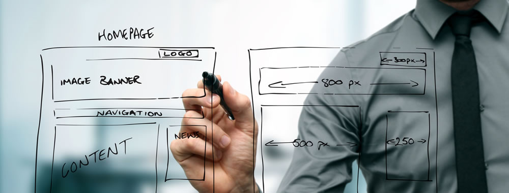
The design process starts by asking you a series of questions about who your site is for and what colors and character you, your business, or organization has or you want it to have. Then I give you a long list of well designed websites to help you decide what design elements and styles you would like your site to have.
After that, we will work on a first design idea for your site. After feedback from you, we can either refine that design or work on a couple more very different designs that will suit your needs. We will keep working on and refining the design until we have a finished layout of how your site will look when completed.
Once the design phase is finished, we will work on the building of the site using markup, styles, and code to convert the graphical design into a functioning website.
Examples of Work
We have quite a few examples of design work we have done for our other clients if you would like to see the quality of work that Truecast does. See our Work Portfolio.
Technology and Trends
Mobile First
With more than half of internet traffic coming from users on mobile platforms, we think it’s important to design websites with a mobile first mind set. This means we design websites which are as easy to use on mobile than they are on desktop computers. With current browser technology, it’s possible to tell web sites to adapt to whatever device a person is using to view a web site. During the design status of web development, mobile first means designing an online user experience for mobile devices before designing it for the desktop browsers. In the past, when designers focused on the desktop market, mobile design was an afterthought. Today, more and more people are using their mobile devices for online shopping, social networking, and research. The sites that are easiest to use on a phone tend to get the most mobile traffic. Google is now even ranking mobile friendly sites higher in the search results. Mobile first requires a different approach to planning, user experience (UX) design, and development that puts small screen devices at the front of both strategy and implementation. Companies need to stay on top of changing trends to attract visitors and customers.
Three Line Menu Icon
There’s no doubt that it’s widespread use makes the function easily recognizable for users. It is a design trend that should be made use of wherever needed.
Long scroll
Placing all your important page elements above the fold, which is a moving target, is now a well-known myth. Almost everyone is accustomed to long scrolling page thanks in part to mobile devices. The design layout works especially well for sites that want to lead users down a certain path.
Card Layouts
Pinterest was one of the first to use this design layout. Cards are used all over the place on the web because they present information in small chunks great for scanning. Each card represents one unified concept or idea. The rectangles are content containers that can easily be re-arrange for different device sizes.
Hero Images
Because websites are mainly a visual experience, large hero images are one of the quickest ways to grab a visitor’s attention. Because of advances in bandwidth and data compression, visitors won’t suffer from slow load times most of the time. A hero image is a specific type of large banner image, prominently placed on a web page above the fold, generally in the front and center and full width of the browser window.
Rich Animations
Animations are being used more and more to enhance a website’s communication and user interaction. Motion is a great way to draw the visitor's attention to something that is important that they might miss seeing otherwise. It needs to be carefully thought out how it adds to or detracts from the user experience.
Microinteractions
They can communicate a status or bit of feedback, allow the user to see the result of an action, or help the user manipulate something. It is a way to providing instant, clear feedback about the action they just preformed. These can really help to make a website enjoyable to use and less confusing.
Material Design: A Richer Alternative to Flat Design
In 2016, Google launched a new style language called Material Design. It uses shadow effects and the concepts of movement and depth in order to create designs that appear more realistic to the user. Its goal is to create a visual language that synthesizes classic principles of good design with the innovation and possibility of technology and science. It is a way to develop a single underlying system that allows for a unified experience across platforms and device sizes. Mobile precepts are fundamental, but touch, voice, mouse, and keyboard are all first-class input methods.
Responsive Design
Responsive Web design is an approach where the website design responds to the user’s behavior and environment based on screen size, platform, and orientation. This design trend combines flexible grids and layouts, images and an intelligent use of CSS media queries. As the user switches from their laptop to iPad, the website should automatically switch to accommodate for resolution, image size and scripting abilities. In other words, the website should have the technology to automatically respond to the user’s preferences. This would eliminate the need for a different design and development phase for each new gadget on the market.